Hardie Board Siding Colors: A Complete Guide to Choosing the Right Color for Your Home
Choosing new siding is exciting until you realize how many decisions are packed into one word: color. The shade that looks perfect on a small sample can feel entirely different across a two-story exterior. Morning shade, afternoon sun, roof color, stonework, landscaping, window frames, and even the neighboring homes can change how a siding color reads.
This guide makes the decision easier. Below, you can explore the most popular Hardie board siding colors, compare the current James Hardie Statement Collection color families, discover proven siding-and-trim combinations, and learn how to choose a palette that works with your home’s architecture and California climate.
Homeowners often use the term “Hardie board” to describe James Hardie fiber cement siding. James Hardie refers to its exterior products as Hardie® siding, including Hardie® Plank lap siding, Hardie® Panel vertical siding, Hardie® Shingle siding, trim, soffit, and related exterior products.
What Are the Most Popular Hardie Board Siding Colors?
If you want a dependable starting point, begin with Arctic White, Iron Gray, Aged Pewter, Boothbay Blue, Mountain Sage, Deep Ocean, Cobble Stone, Light Mist, Monterey Taupe, and Khaki Brown. These colors cover the most requested exterior directions: classic white, modern charcoal, warm gray, blue-gray, sage green, navy, soft neutral, light gray, taupe, and earthy brown.
Arctic White remains one of the safest and most versatile choices for long-term curb appeal. Iron Gray, James Hardie’s 2026 Color of the Year, creates a darker and more dramatic exterior. Boothbay Blue and Mountain Sage add recognizable color while remaining muted enough to work as near-neutrals. Aged Pewter, Cobble Stone, and Monterey Taupe are especially useful when the siding must coordinate with existing stone, brick, roofing, or warm landscaping.
What Is James Hardie ColorPlus® Technology?
James Hardie offers fiber cement siding that is primed for field painting as well as siding with ColorPlus® Technology, a factory-applied and baked-on finish. ColorPlus siding is finished in a controlled environment so the color is applied consistently across the boards rather than being painted after installation in changing outdoor conditions.
The finish is engineered to resist fading, chipping, peeling, and cracking. James Hardie currently backs ColorPlus finishes with a 15-year limited finish warranty, while qualifying Hardie siding products carry a 30-year limited, non-prorated substrate warranty. Always review the current written warranty for the exact product, finish, installation, and maintenance requirements.
ColorPlus Siding vs. Primed Hardie Siding
| Option | Best For | Primary Advantage | Important Consideration |
|---|---|---|---|
| ColorPlus® Technology | Homeowners who want a curated factory-finished color | Consistent baked-on finish with a manufacturer finish warranty | Available colors depend on product, profile, texture, and region |
| Primed for Paint | Custom colors, historical palettes, or HOA-specific paint requirements | Nearly unlimited exterior paint choices | Requires proper field painting and follows the paint manufacturer’s finish warranty |
ColorPlus is often the simplest path when you find a factory color you love. Primed siding is valuable when the exterior must match an existing custom shade or when a design calls for a color outside the stocked collection.
James Hardie Statement Collection® Siding Colors
The Statement Collection is James Hardie’s curated palette of factory-finished colors. The collection is designed to make exterior color selection more manageable than choosing from hundreds of paint chips. Exact availability varies by ZIP code, siding profile, texture, and local distributor, so confirm the final product and color with your contractor before designing the entire exterior around one shade.
The current Statement Collection includes up to 19 colors across white, neutral, brown, green, gray, blue, red, and near-black families.
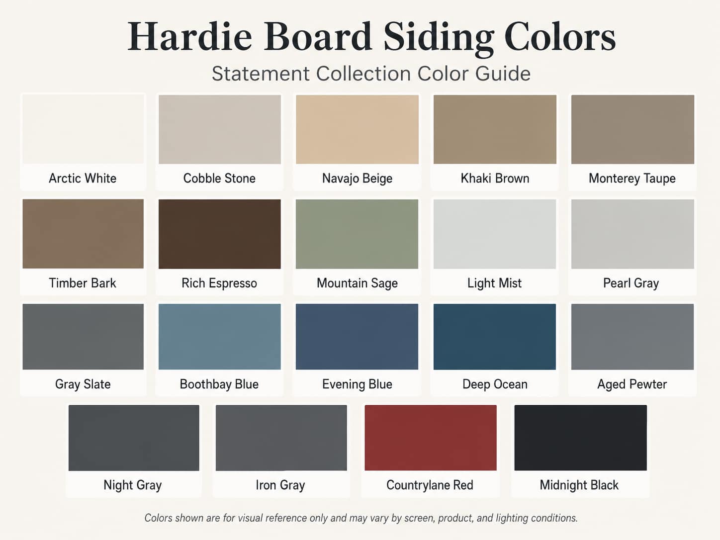
Important: Color names and availability can change. Some colors may be limited to certain products, textures, or markets. Always confirm current local availability and view an actual product sample before ordering.
10 Popular Hardie Board Colors and Why Homeowners Choose Them
1. Arctic White: Bright, Timeless, and Flexible
Arctic White works because it does not lock the rest of the exterior into one design direction. Pair it with black windows for a modern farmhouse look, warm wood for a softer contemporary home, navy shutters for a traditional exterior, or matching white trim for a clean monochromatic finish. It can also make architectural shadows, landscaping, and masonry more noticeable because the siding itself remains visually quiet.
White siding shows contrast clearly, so flashing details, trim alignment, gutters, and installation quality matter. The payoff is a bright exterior that is easy to update later through smaller elements such as the door, lighting, shutters, or landscaping.
2. Iron Gray: Bold Without Going Fully Black
Iron Gray is designed for homeowners who want a darker exterior with more dimension than solid black. It can look modern with matching trim, classic with Arctic White trim, or organic with cedar and stone. James Hardie named Iron Gray its 2026 Color of the Year, reflecting the continuing demand for dark but livable exterior neutrals.
On a large home, use Iron Gray thoughtfully. A darker body color can visually increase the weight of the structure. Breaking it up with lighter trim, stone, a warm garage door, or a second siding profile can keep the facade from feeling flat.
3. Aged Pewter: The Easy-to-Coordinate Gray
Aged Pewter is a useful transition color when the home already has fixed materials with mixed warm and cool undertones. It is less severe than a dark charcoal and more substantial than a pale gray. That balance works well on ranch, Craftsman, transitional, and traditional homes.
Pair Aged Pewter with white trim for crisp definition, cream trim for a warmer result, or dark trim for a quieter monochromatic design. It is also a strong backdrop for brick because it rarely competes with the brick’s natural color variation.
4. Boothbay Blue: A Blue That Behaves Like a Neutral
Boothbay Blue is one of the most recognizable James Hardie colors because it introduces color without becoming loud. Its muted blue-gray quality allows it to complement white trim, cool stone, charcoal roofs, and natural wood. In brighter sunlight it can appear lighter and grayer; in shade, the blue becomes more noticeable.
This color works particularly well on coastal, cottage, Craftsman, farmhouse, and traditional architecture. It is also a smart choice for homeowners who are tired of gray but do not want a saturated blue exterior.
5. Mountain Sage: Natural, Calm, and Architectural
Mountain Sage connects the home to the landscape. It works especially well near mature trees, vineyards, foothills, gardens, and natural stone. White trim creates a familiar Craftsman or cottage look, while warmer trim and bronze fixtures make the color feel more organic.
Sage siding is increasingly used as a whole-house color, but it can also serve as an accent on gables, board-and-batten sections, or an entry area. Because green changes significantly beside landscaping, view the sample against the plants and trees that will remain after the project.
6. Deep Ocean: A Sophisticated Navy Exterior
Deep Ocean gives a home the formality of a dark exterior while retaining visible color. It pairs naturally with white trim, cedar, copper, brick, and light stone. On a Colonial or traditional home, the result can feel established and classic. On a modern farmhouse, it creates a more distinctive alternative to white and black.
Dark blue is sensitive to surrounding light. Test the sample on every major elevation, especially if one side of the home receives intense afternoon sun while another remains shaded.
7. Light Mist: A Soft Modern Gray
Light Mist is a good choice when white feels too bright but the homeowner still wants a light exterior. It supports black windows, white trim, blue-gray accents, and contemporary mixed-profile designs. It can also help a smaller home feel open without losing all visual definition.
Because pale gray can pick up blue, green, or beige reflections from nearby surfaces, compare it directly with the roof, driveway, masonry, and window frames.
8. Cobble Stone: A Warmer Alternative to White
Cobble Stone softens an exterior while preserving the brightness homeowners often want from a light siding color. It is especially helpful when the roof, stone, or brick has tan, cream, brown, or warm gray undertones that could make a cooler white look disconnected.
Use it as the main siding color with Arctic White trim, or reverse the relationship and use Cobble Stone on trim and accents to warm up a white or green exterior.
9. Monterey Taupe: A Practical Warm Neutral
Monterey Taupe is neither obviously gray nor obviously brown. That makes it adaptable to stucco, brick, stone, bronze windows, and a wide range of roof colors. It feels appropriate on California ranch homes, Craftsman exteriors, Mediterranean-influenced homes, and traditional suburban architecture.
It is also an effective middle-value color: not so light that every shadow or dusty mark stands out, and not so dark that the siding dominates the entire facade.
10. Khaki Brown: Earthy and California-Friendly
Khaki Brown complements dry landscapes, oak trees, warm stone, clay-toned roofs, and the golden colors common throughout inland California. It can look understated with matching or cream trim, or more defined with Arctic White.
For a layered exterior, combine Khaki Brown lap siding with a darker Timber Bark accent, warm stone, and bronze lighting. The result feels natural without relying on a single flat beige.
Hardie Siding and Trim Color Combinations That Work
A successful exterior is rarely about the siding color alone. The body, trim, roof, windows, doors, stone, brick, gutters, and garage doors must read as one coordinated palette. Most homes look best with two or three primary exterior colors rather than a different color on every feature.
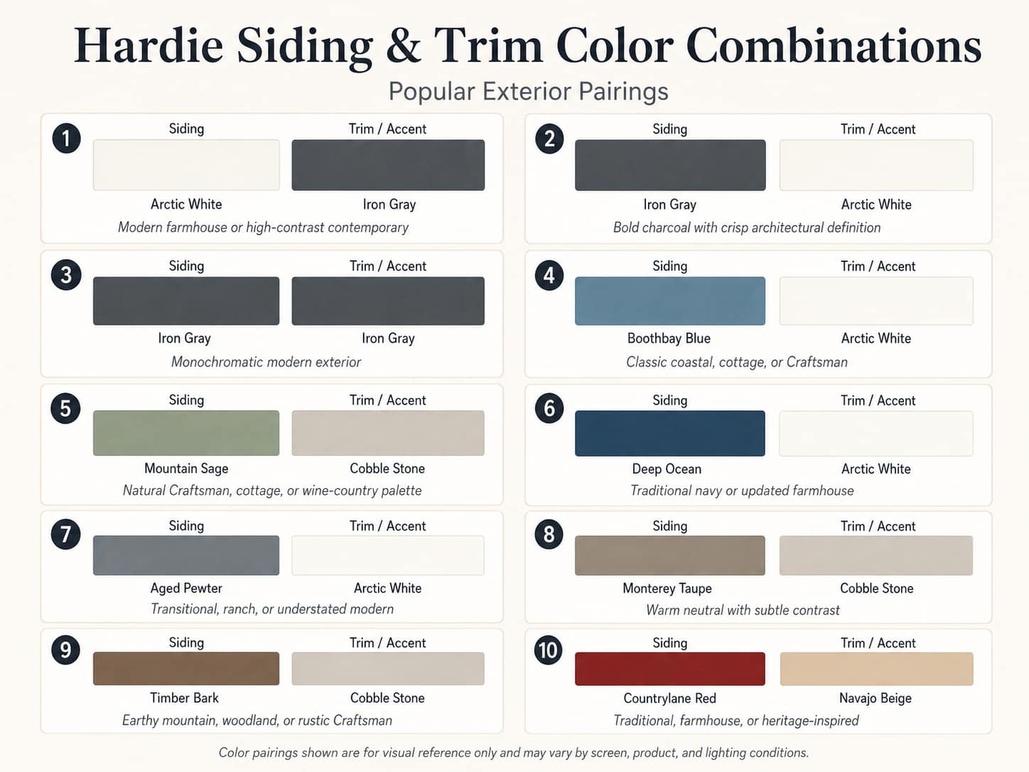
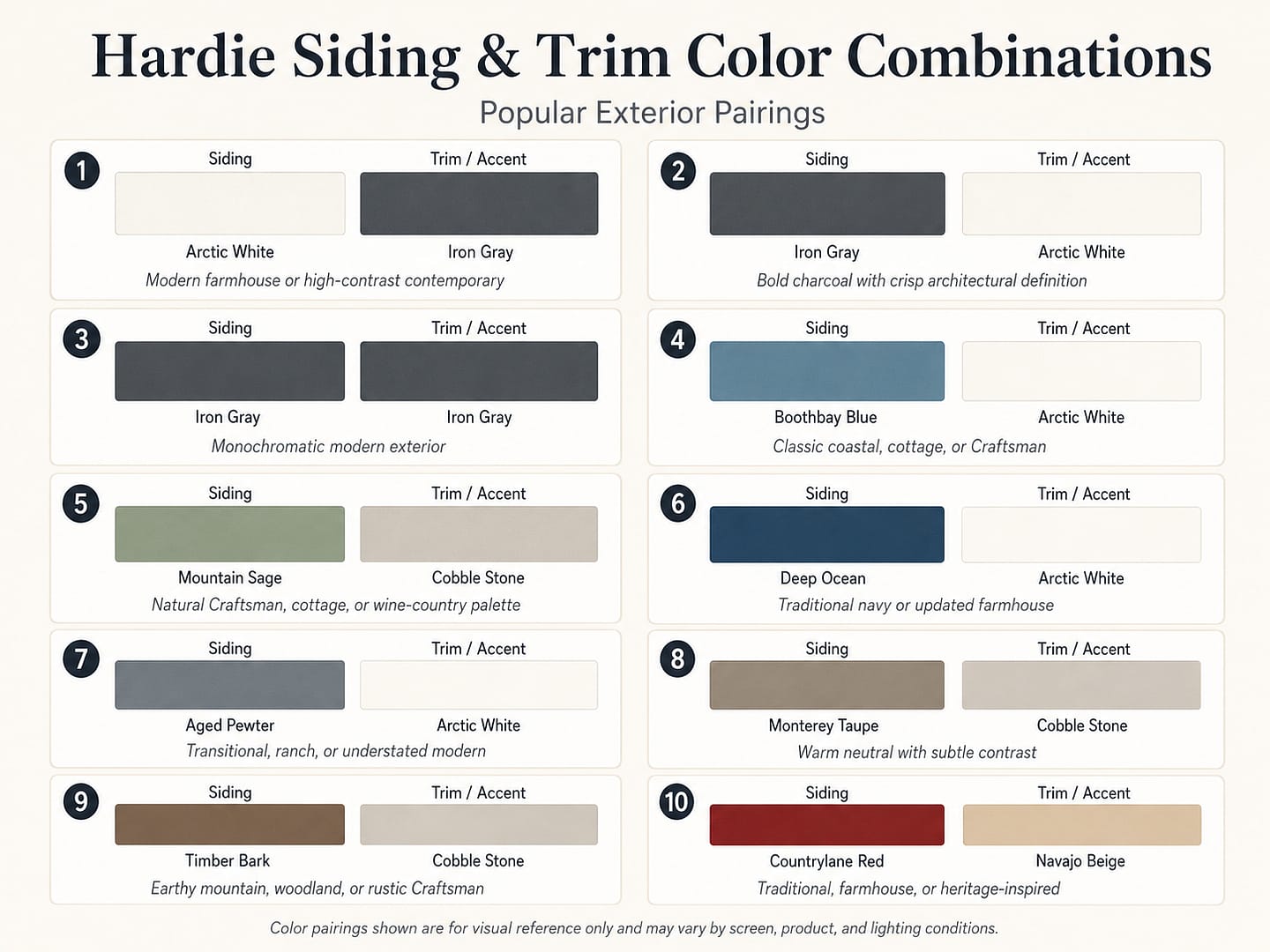
High-contrast trim outlines windows, rooflines, corners, and decorative details. It is useful when the architecture has features worth emphasizing. Low-contrast or matching trim creates a cleaner exterior with fewer visual breaks. It is popular on modern homes and can make a complicated facade feel calmer.
Before defaulting to white trim, ask whether the home benefits from strong outlines. White is effective, but it is not mandatory. A warm neutral, matching body color, or slightly darker trim can create a more custom result.
Best Hardie Board Siding Colors by Home Style
Modern Farmhouse
Start with Arctic White, Iron Gray, Night Gray, or Deep Ocean. Use vertical Hardie Panel and batten details on gables or entry sections, then balance darker colors with wood, stone, or a warm garage door. Black windows produce the strongest modern contrast; white windows soften the look.
Craftsman
Mountain Sage, Boothbay Blue, Aged Pewter, Timber Bark, Monterey Taupe, and Khaki Brown support the Craftsman emphasis on natural materials and layered details. Craftsman homes can handle a three-color scheme when each color has a clear job: body, trim, and accent.
Ranch
Ranch homes often have long horizontal rooflines, so mid-tone colors help provide structure without making the facade feel heavy. Consider Aged Pewter, Monterey Taupe, Light Mist, Boothbay Blue, or Khaki Brown. A contrasting front door can add personality without overcomplicating the siding.
Colonial or Traditional
Arctic White, Navajo Beige, Cobble Stone, Evening Blue, Deep Ocean, and Countrylane Red work well with symmetrical facades and traditional trim. Keep the main palette controlled and use shutters, doors, or hardware for stronger accents.
Contemporary
Iron Gray, Midnight Black, Night Gray, Deep Ocean, Light Mist, and Gray Slate complement simple forms, mixed siding directions, large windows, and minimal trim. Matching body and trim colors can strengthen the clean geometry of the design.
Coastal or Cottage
Boothbay Blue, Light Mist, Pearl Gray, Arctic White, Evening Blue, and Mountain Sage create a light and relaxed exterior. White trim is a dependable pairing, while natural wood can keep the palette from feeling overly themed.
Mediterranean or California Transitional
When fiber cement siding is combined with stucco, stone, or tile roofing, warmer neutrals tend to coordinate naturally. Look at Cobble Stone, Navajo Beige, Monterey Taupe, Khaki Brown, and Aged Pewter. Match the siding undertone to the fixed masonry rather than selecting the siding in isolation.
Choosing Hardie Board Siding Colors for California Homes
California color selection is influenced by intense sunlight, dry inland landscapes, marine light, mature trees, wildfire-conscious exterior design, and a wide variety of regional architecture. The same sample can look warmer in Sacramento afternoon sun, cooler near the coast, and much darker on a shaded wine-country property.
Sacramento and the Greater Central Valley
For Sacramento, Elk Grove, Roseville, Folsom, Rancho Cordova, Fresno, Clovis, and Bakersfield, evaluate color under direct afternoon sun. Light and mid-tone colors such as Arctic White, Cobble Stone, Light Mist, Aged Pewter, Monterey Taupe, and Khaki Brown are versatile starting points. Mountain Sage and Boothbay Blue add color while remaining muted enough to coordinate with dry-season landscaping.
Darker colors such as Iron Gray, Night Gray, Deep Ocean, and Midnight Black can look excellent, especially on modern homes, but they should be tested across a larger section of the exterior. Dark samples often appear more intense when multiplied across an entire sun-facing wall.
Santa Rosa, Sonoma, Napa, Marin, and the North Bay
Wine-country and North Bay homes frequently sit beside mature vegetation, warm stone, redwood, oak, vineyards, or coastal-influenced light. Mountain Sage, Boothbay Blue, Monterey Taupe, Aged Pewter, Timber Bark, Cobble Stone, and Arctic White are natural fits. A muted exterior often allows the landscape and architecture to carry more of the visual impact.
For homes closer to marine air or frequent fog, view samples during both bright and overcast conditions. Blue-gray and green-gray siding can shift noticeably as the light changes.
California Fire-Prone and WUI Areas
Color does not determine whether siding is noncombustible. The product, wall assembly, installation details, vents, roof, windows, defensible space, and local code requirements all matter. Hardie fiber cement siding is classified as noncombustible, but homeowners should work with qualified professionals and local building authorities when planning exterior improvements in a Wildland-Urban Interface area.
Northwest Exteriors provides James Hardie siding installation and exterior design guidance throughout its California service areas. Explore our exterior siding options in the Sacramento area, Santa Rosa siding services, Fresno siding services, and Bakersfield siding services.
How to Choose the Right Hardie Siding Color
The best exterior colors are selected in context. Follow this process before approving the order.
1. Begin With the Features That Are Not Changing
List the roof, brick, stone, stucco, driveway, windows, garage doors, gutters, and major landscaping that will remain. These fixed elements narrow the palette. A siding color should either share an undertone with those materials or create an intentional contrast.
2. Identify the Undertones
Gray is not simply gray. Some grays lean blue, some green, and some brown. White can be cool and crisp or warm and creamy. Place samples directly beside the roof and masonry to reveal undertones that are difficult to see on a standalone swatch.
3. Decide Whether You Want Contrast or Continuity
A high-contrast palette makes trim, gables, windows, and corners stand out. A low-contrast palette lets the home’s shape and texture do more of the work. Neither is automatically better. The right choice depends on the architecture and how many details deserve attention.
4. Consider the Size and Shape of the Home
Dark colors can make large wall areas feel more substantial, while light colors tend to feel open and expansive. A tall home may benefit from a darker lower section or a change in siding profile. A long ranch may need a defined entry or accent gable to break up the horizontal line.
5. Match the Color to the Siding Profile
The same color reads differently on smooth lap siding, wood-grain lap siding, shingle siding, and vertical panel siding. Shadows between boards and battens can make vertical siding appear deeper. Texture can make a light color feel softer and a dark color feel more dimensional.
6. Test Large Physical Samples Outdoors
Small chips are not enough. Use the largest available product sample and place it on different sides of the house. Review it in morning light, midday sun, late afternoon, shade, and overcast conditions. Keep the sample up for several days rather than making the decision during one appointment.
7. Review HOA and Local Design Requirements
Some communities restrict exterior colors, contrast levels, or approved materials. Confirm the approval process before ordering. Physical samples, manufacturer color names, and elevation images can make an architectural review submission clearer.
8. Think Beyond Today’s Trend
There is nothing wrong with choosing a current color, but the exterior should still feel appropriate when design trends move on. If you love a bold color but are uncertain about using it across the entire home, apply it to a gable, entry section, front door, or detached feature first.
9. Use a Simple Three-Part Palette
A practical formula is:
- Body color: the dominant siding color
- Trim color: fascia, corners, window and door surrounds
- Accent color: front door, shutters, gable, or secondary siding profile
Not every home needs three colors, but this structure prevents the palette from becoming random.
10. Ask for Professional Color Guidance
An experienced siding consultant can help identify undertones, product availability, profile limitations, and combinations that work with the actual home. This is particularly valuable when the project includes mixed materials, multiple siding profiles, a difficult roof color, or a large architectural change.
Can You Mix Hardie Siding Colors and Styles?
Yes. Mixing color, profile, or texture is one of the most effective ways to add architectural interest. The key is to create a hierarchy rather than treating every section as a separate design.
- Use lap siding as the main body and vertical panel siding on gables.
- Use shingle siding on a dormer, upper story, or entry feature.
- Keep one color across multiple profiles for subtle texture.
- Use a second color only where the architecture creates a natural stopping point.
- Repeat the accent color in a door, window frame, roof detail, or masonry element.
For example, an Arctic White lap-siding body with Iron Gray board-and-batten gables creates strong contrast. A more restrained alternative would use Aged Pewter on both profiles, allowing the change in shadow and direction to provide the visual interest.
Why Installation Quality Matters With Dark and High-Contrast Colors
Color can reveal workmanship. Dark siding with bright trim makes every cut, seam, corner, and flashing transition more visible. A monochromatic dark exterior can be unforgiving if touch-up paint is overused or if accessory colors do not match. Proper storage, handling, cutting, fastening, flashing, clearances, caulking, and manufacturer-approved touch-up practices all affect the finished appearance.
Northwest Exteriors has provided home exterior improvements for more than 30 years and has worked with James Hardie siding since 1997. Our team helps homeowners compare siding profiles, colors, trim details, and installation options before the project begins—not after the materials arrive.
Frequently Asked Questions About Hardie Board Siding Colors
What is the most popular James Hardie siding color?
Arctic White has long been one of the most popular and widely used James Hardie colors because it works with many architectural styles and accent colors. Iron Gray, Aged Pewter, Boothbay Blue, Mountain Sage, Deep Ocean, and Light Mist are also popular choices. The best color for your home depends on its roof, architecture, surroundings, and light exposure.
What is James Hardie’s 2026 Color of the Year?
James Hardie’s 2026 Color of the Year is Iron Gray, a deep charcoal neutral available within the Statement Collection. It can be paired with Arctic White for contrast or used with matching trim for a monochromatic modern exterior.
How many Hardie board siding colors are available?
The Statement Collection includes up to 19 curated colors, with exact availability varying by region and product. The made-to-order Dream Collection offers nearly 700 ColorPlus finish options in the United States. Primed Hardie siding can also be finished with an appropriate custom exterior paint.
Do Hardie siding colors fade?
Every exterior finish is exposed to sunlight and weather, but ColorPlus Technology is engineered to resist fading and discoloration more effectively than a typical field-applied finish. ColorPlus products currently include a 15-year limited finish warranty. Maintenance, exposure, installation, and local conditions can affect long-term appearance.
Can Hardie board siding be repainted?
Yes. James Hardie fiber cement siding can be repainted when properly cleaned, prepared, and coated with a compatible exterior paint. Follow the current James Hardie instructions and paint manufacturer’s requirements. Repainting ColorPlus siding may affect the remaining finish warranty, so review the warranty before changing the factory color.
Are dark Hardie siding colors a good idea?
Dark colors can create a striking exterior and fiber cement is well suited to modern dark-color designs. However, dark colors make a stronger visual statement, can show surface dust or residue differently, and may expose installation details more clearly. Test a large sample on the actual home before selecting Iron Gray, Night Gray, Deep Ocean, Rich Espresso, or Midnight Black.
What Hardie color goes best with a black roof?
A black or charcoal roof can work with Arctic White, Light Mist, Pearl Gray, Boothbay Blue, Mountain Sage, Aged Pewter, Cobble Stone, and many darker monochromatic colors. The roof’s undertone and texture matter, so compare the siding sample directly beneath the roof in natural light.
What Hardie color goes best with red brick?
Red brick often coordinates well with warm neutrals and muted colors such as Aged Pewter, Cobble Stone, Monterey Taupe, Khaki Brown, Mountain Sage, and some blue-gray shades. Pull a secondary color from the brick rather than trying to match its strongest red or orange tone.
Should siding be lighter or darker than the roof?
Either can work. A lighter body with a darker roof is a familiar and balanced combination. A dark body and dark roof create a more dramatic contemporary result but may need lighter masonry, wood, or entry details to prevent the exterior from feeling visually heavy.
Should trim be lighter than Hardie siding?
Trim is often lighter because contrast highlights the architecture, but it does not have to be. Matching trim produces a modern, streamlined look. Slightly darker or warmer trim can create subtle depth without the sharp outline of white.
How do I know what a Hardie color will look like on my house?
Use physical product samples and view them on multiple elevations at different times of day. A digital visualizer can help compare broad design directions, but the final decision should be based on real samples beside the home’s roof, windows, masonry, and landscaping.
Are all Hardie colors available in every siding style?
No. Availability depends on your region, product line, texture, profile, dimensions, and local stocking program. Confirm the exact combination of color and product before finalizing the design.
See Hardie Board Siding Colors on Your California Home
A color chart is a useful starting point, but your home deserves a palette chosen for its architecture, roof, surroundings, and natural light. Northwest Exteriors can help you compare James Hardie siding colors, coordinate trim and accents, select the right siding profiles, and plan a professionally installed exterior.
We serve homeowners throughout the Greater Sacramento area, Santa Rosa, Sonoma and Napa communities, Marin, Fresno, Bakersfield, and surrounding California service areas.
Schedule Your Free Siding Estimate Explore James Hardie Siding